
The Importance of Data Visualisation in Accounting
Data visualisation is not just another analytical method — it’s a powerful way to take data interpretation to the next level. With the use of visual elements such as graphs, charts, maps and dashboards, data visualisation creates a more intuitive way of understanding data.
However, as technology evolves, the way data is collected and analysed becomes increasingly sophisticated. Without data visualisation, the findings from all this information would be lost in a sea of numbers. This is especially true for accountants, who must regularly make sense of large amounts of data.
Data visualisation allows accountants to see beyond the numbers and uncover trends, patterns and relationships that would otherwise be hidden. It is essential for improving workflows, making better decisions and communicating findings to clients and colleagues.
Why data visualisation is important for accountants
Accountants handle a lot of data. For example, financial statements, tax returns, invoices, ledgers and other financial documents are all full of numbers that must be interpreted and communicated to clients and colleagues. Data visualisation provides a way to make this information more digestible. After all, 90 percent of information sent to the brain is visual, making it the most effective method to comprehend and recall data.
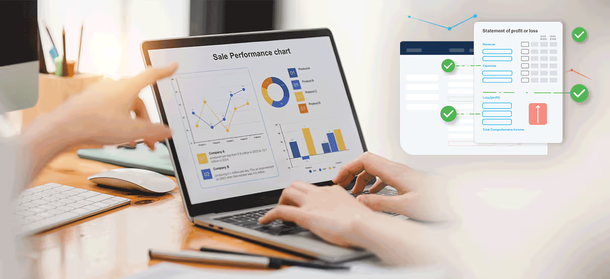
There are many different types of data visualisation, but some common examples include bar charts, line graphs and pie charts. These visuals can show relationships between different data points, identify trends over time, or compare datasets.
For example:
- A bar chart could be used to compare revenue from different product lines.
- A pie chart could show the distribution of expenses across different categories or compare the market share of different companies.
- Line graphs are a type of data visualisation that show changes over time. They are especially well-suited for financial data, such as sales figures, stock prices or economic indicators.
Data visualisation can also be used in various ways to spot anomalies and outliers, which can be valuable for detecting fraud or errors.
Whether you need to present data to a client, colleagues or managers, data visualisation can help you communicate your findings clearly and concisely.
Benefits of using data visualisation in accounting
There are many benefits to using data visualisation in accounting, such as:
- Improving workflows by making it easier to spot errors, identify trends and make comparisons. It can also help you save time by automating repetitive tasks like generating reports.
- In addition, data visualisation can be used to create audit trails. This is because data visualisation can help track changes over time, which can help identify discrepancies or irregularities.
- It also helps accountants to better understand the data they are working with. By seeing trends and patterns, they can make sense of complex datasets more easily.
- Furthermore, it can help put data into context, making it easier to see how it relates to other datasets.
In addition to all of the practical benefits, data visualisation also has the potential to transform the way you think and communicate about data.
Improved data analysis
Data visualisation is not just about making information easier to understand. It also has the potential to improve the quality of your data analysis. Through data visualisation, you can more easily identify patterns and relationships. This leads to insights that would otherwise be difficult or impossible to see.
For instance, imagine you are looking at a table of financial data. Without data visualisation, it would be difficult to spot trends or compare different datasets. However, if you were to create a line graph of the data, you can quickly see any patterns or trends. This allows you to make better decisions about where to allocate resources, what strategies to pursue, and how to improve operations.
By leveraging data to improve client business performance, accountants can provide value beyond compliance and improve client relationships.
Enhanced decision-making
Data visualisation can also help accountants and business owners make better decisions. This is because it allows you to easily weigh different options and compare trade-offs.
For example:
- Let’s say you are trying to decide whether to invest in Company A or Company B. Without data visualisation, you would have to manually compare a variety of financial indicators, such as revenue, profit margins and debt levels. This can be time-consuming and difficult to do.
However, if you were to visualise the companies’ financial data, you could quickly and easily see which company is more attractive from an investment standpoint.
Greater clarity and communication with clients and executives
Data visualisation bridges the communication gaps between accountants and clients or executives. When presenting data, it’s often difficult to know what information is most important or how to present it in a way that is easy to understand.
For example:
- Imagine you are trying to explain the concept of risk to a client. Without data visualisation, you would likely have to use a lot of words and jargon to explain what risk is and why it’s important. However, if you were to visually present the risks, they could see the dangers more clearly and understand why mitigating those risks is so important.
Moreover, data visualisation can be used as part of a collaborative tool to improve communication between internal auditors and executives. When explaining an audit’s findings or financial risk analysis results, visuals make the information easier to understand.
For example:
- Say you are trying to explain to your boss why a certain department is over-budget. Without a visual, they might not understand the information or see the big picture. With a visual of the department’s budget, they could more easily see where the money is being spent and identify areas of concern.
Ultimately, the benefits go beyond just the individual accountant. Data visualisation helps organisations as a whole to make better decisions, improve communication and increase transparency.
Challenges of data visualisation in accounting
Despite the many benefits of data visualisation, accountants face some challenges when using this method. First, data visualisation requires a certain level of technical expertise. This is because creating an effective visual requires understanding how to use different software programs and tools.
Another challenge is that data visualisation can be time-consuming, given that it often requires collecting data from multiple sources, cleaning and organising it, and creating the actual visual. This can be a daunting task, especially for busy accountants who are already juggling many different responsibilities.
However, while there are some challenges associated with data visualisation, there are also ways to overcome them.
Ensuring accuracy and clarity in their visualisation
One of the most essential things accountants need to do when using data visualisation is to ensure their visuals are accurate and clear. This can be a challenge when working with large and complex datasets. However, there are some steps that accountants can take to make sure their visuals are as accurate as possible:
- Use data from reliable sources: When collecting data for their visuals, accountants should use data from reliable sources to ensure the information is accurate and up-to-date.
- Check for accuracy: Once the data has been collected, accountants should check for accuracy by double-checking calculations and comparing data from different sources.
- Use clear labels and captions: When creating the actual visual, accountants should use clear labels and captions to explain what the data is showing. This will help to ensure viewers understand the information being presented.
- Use simple designs: Data visuals should have a user-friendly design. This means using simple designs and avoiding clutter.
Ensuring accuracy and clarity is essential for accountants who want to use this tool effectively.
Avoiding bias in their visualisation
Bias in data visualisation can come from several different sources, including our personal biases, the way the data is collected, and the way the visualisation is designed.
Some common types of bias that can creep into data visualisation include:
- Selection bias: This happens when only certain data is included in visualisations while excluding other data that might be just as important.
- Design bias: This happens when you design visualisations in a biased way, for example, by using colours or shapes that convey a certain message.
- Interpretation bias: This happens when you interpret the data in a biased way, for example, by coming to conclusions that are not supported by the data.
However, there are some steps that accountants can take to avoid bias in their visuals:
- Be aware of your own biases
- Consider different viewpoints
- Get feedback from others
By taking these steps, accountants can help ensure their data visuals are accurate and free from bias.
Working with large and complex datasets
Accountants often find themselves working with large and complex datasets. While this data can provide valuable insights, it can also be challenging to work with.
One of the biggest issues accountants face when working with large datasets is choosing the right visuals. With so much data, it can be difficult to know which visuals will best represent the information. The wrong visual can make data seem unorganized and confusing, while the right one can help communicate what the data is saying.
Another challenge of working with large data sets is that they can be time-consuming and difficult to manage. This is why accountants need to use an all-in-one platform to make their work easier. An all-in-one platform saves time by allowing accountants to access all their data in one place. It can also help make data management more manageable by providing tools for organising and analysing data.
Different types of data visualisation
Not every dataset is the same, and not every data visual will work for every situation. This is why it is crucial for accountants to know the different types of data visualisation and when to use them.
Some of the most common types of data visualisation used in accounting include:
- Bar charts
- Line graphs
- Pie charts
- Tables
- Maps
- Infographics
- Dashboards
By understanding the different types of data visualisation, accountants can choose the right tool for the job.
Creating effective data visuals
Creating an effective visual is not always easy. Several factors must be considered, such as the type of data, the goal of the visual, and the audience.
When creating data visuals, accountants should keep the following tips in mind:
- Analyse your audience — Who will be seeing your visual? What is their level of expertise? What are they looking to learn? Answering these questions will help you create a visual tailored to your audience.
- Identify your goals — What do you want to achieve with your visual? Do you want to communicate a data-driven story? Do you want to explain a complex concept? Knowing your goals will help you choose the right type of visualisation approach.
- Collect the right data — Not all data is created equal. When collecting data for your visual, be sure to choose accurate, up-to-date and relevant data.
- Choose the right type of visualisation method — As mentioned before, there are different types of data visualisation. Choose the visualisation method that is best suited for your data and your goals.
- Use software — Many different software programs can help with data visualisation. Some of the most popular options include Microsoft Excel and Google Sheets.
Creating an effective visual is not always easy. Still, it can come in handy for tricky situations such as providing information for internal or external auditing, as it is an easy way to track changes within the data over time. Ultimately, data speaks, and data visualisation helps accountants listen


.jpg)
.png)


